Compare white lacquers against paper, fabric and each other
White lacquer is not a single visual choice. A shade can appear cooler, warmer, softer or more opaque depending on its neighbors. Build a comparison that keeps those questions separate, using dried practice swatches and familiar materials instead of trusting the color shown on a screen.
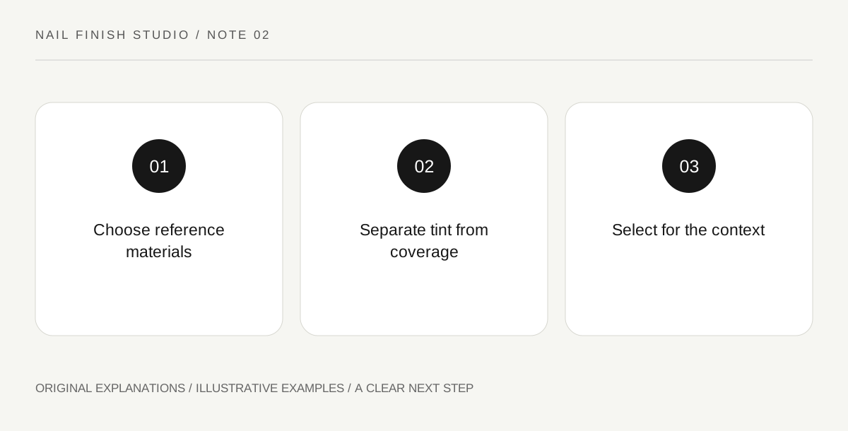
Original explanatory diagram. Read the full method and limitations below.
Choose a useful reference background
Place the swatches beside plain white paper and a fabric you often wear. Neither reference is a perfect scientific white, but both help reveal differences that disappear when each polish is seen alone. Keep the materials consistent during the comparison. If one fabric has a strong cream tone, name that influence in the note. The purpose is to see relationships, not to declare one shade the only correct white.
Separate undertone from transparency
A sheer white can reveal the background and therefore appear different from an opaque white even when their tint is similar. Record the supported layer sequence and background for each swatch. Do not explain every difference as warmth or coolness. Essie's white jelly product is explicitly described as sheer, which makes it a useful reminder that the words white and opaque answer different questions. Compare like coverage levels where possible.
Change the surrounding color deliberately
Place a navy card beside the swatches, then exchange it for tan or pale pink. Observe which white now feels sharper or softer. Keep the samples themselves unchanged. This exercise shows why a bottle that seemed neutral on a shop shelf may look different beside a chosen outfit. Describe your own visual impression carefully; avoid turning an individual preference into a rule that people with a certain skin tone must wear a particular white.
Make a contextual choice
Write the setting and effect you want: crisp contrast with dark clothing, a gentle pale palette or a translucent finish. Select the swatch that works in that context and note one alternative for another situation. Photograph the arrangement only as a memory aid, since camera processing and displays can shift the relationship. Keep the physical swatch available when making the final choice, especially if several similar bottles are involved.
Illustrative worked example
Illustrative scenario: a learner compares an opaque cool-looking white and a translucent creamy white beside a navy sleeve. The first gives the sharp contrast they want, while the second works better beside a beige scarf. Rather than naming one universally flattering, they label the two contexts. Their notes also record that the products differ in coverage, preventing undertone language from carrying the whole explanation.
Questions that come up
Can a phone photo decide the comparison?
Use it to remember the arrangement, but return to physical swatches. Automatic exposure and white balance can change the differences you are trying to see.
Must white nails match a white garment exactly?
Exact matching is optional. A deliberate contrast in warmth or coverage can be pleasing; choose it consciously rather than assuming every small difference is a mistake.
References and scope
These sources support the factual background. Examples and exercises are original illustrative teaching material. References do not imply endorsement.
- FDA: Nail Care Products — Follow labels and warnings, provide ventilation and handle potentially flammable nail products safely.
- Essie: Arctic Jelly — Manufacturer description of a sheer buildable white jelly finish, not independent performance verification.