Keep a near-black navy visibly blue in your design plan
A deep navy lacquer may read almost black at ordinary distance. That can be exactly the desired effect, or it can hide the color you hoped would lead the design. Compare depth, lighting and neighboring details before adding decoration to solve a problem that may be about color selection.
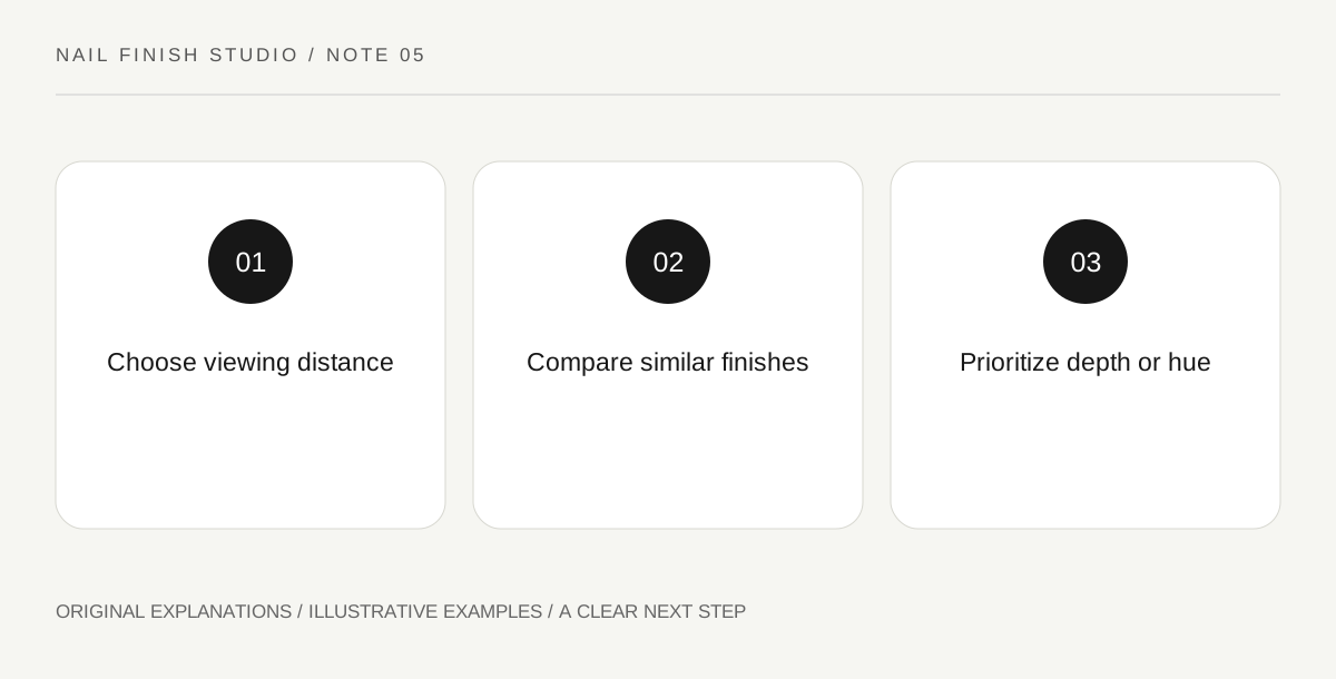
Original explanatory diagram. Read the full method and limitations below.
Define the desired reading distance
Look at the swatch close up, at normal hand distance and across a table. Decide where you want the blue identity to remain obvious. A shade can reveal blue beautifully under a close lamp while functioning as a nearly black block elsewhere. Neither result is a defect. The important choice is whether the color's ordinary appearance matches your intention, rather than whether the bottle contains a name you associate with blue.
Compare depth before changing the surface
Prepare another supported navy swatch that appears slightly lighter or more saturated, if available. Keep the finish similar so the comparison remains about color. Do not automatically add shimmer to the darker shade; reflection introduces another variable. Observe which sample retains its blue identity under the lighting you normally use. A simpler color substitution may achieve the desired effect with fewer layers and less decorative work.
Use surrounding contrast sparingly
Place a pale neutral card and then a medium blue card beside the samples. The relationship can make the dark color feel deeper or more recognizably blue. Consider whether a small clothing or accessory detail already provides that context. Avoid crowding the manicure with additional accents simply to prove the color name. A near-black navy can work as a quiet dark base if that is the role you consciously choose for it.
Choose between depth and obvious hue
Write one sentence describing the final priority. Perhaps you want a dark polished appearance with blue visible only on closer inspection; perhaps you want unmistakable blue from ordinary distance. Select the sample that does that job. Keep the notes about lighting and finish, because a glossy highlight can obscure a small area while the surrounding color remains unchanged. A clear priority prevents endless layering that makes the original navy darker still.
Illustrative worked example
Illustrative scenario: a learner wants a clearly blue manicure for a simple outfit. Their first swatch reads black across the table. A second, slightly lighter navy retains more obvious blue in the same room. They choose the second and keep the first for a future nearly black look. The change follows the intended reading distance rather than an assumption that a more expensive or more reflective product would solve the problem.
Questions that come up
Can a camera prove that the shade is blue?
A photograph can emphasize a highlight or process the color differently. Use it as a record, but assess the actual swatch in the setting that matters to you.
Is an almost-black navy less useful?
It can be a versatile dark choice when subtle blue is the intended effect. Usefulness depends on the role, not on how loudly a shade announces its color name.
References and scope
These sources support the factual background. Examples and exercises are original illustrative teaching material. References do not imply endorsement.
- FDA: Nail Care Products — Follow labels and warnings, provide ventilation and handle potentially flammable nail products safely.