Read a red lacquer under daylight and the room where you will wear it
A red lacquer can seem straightforward in its bottle and surprisingly different at home. Compare it under two ordinary lighting conditions before assigning a fixed color label. The exercise concerns observation and preference, with no promise that a single photograph can represent every appearance.
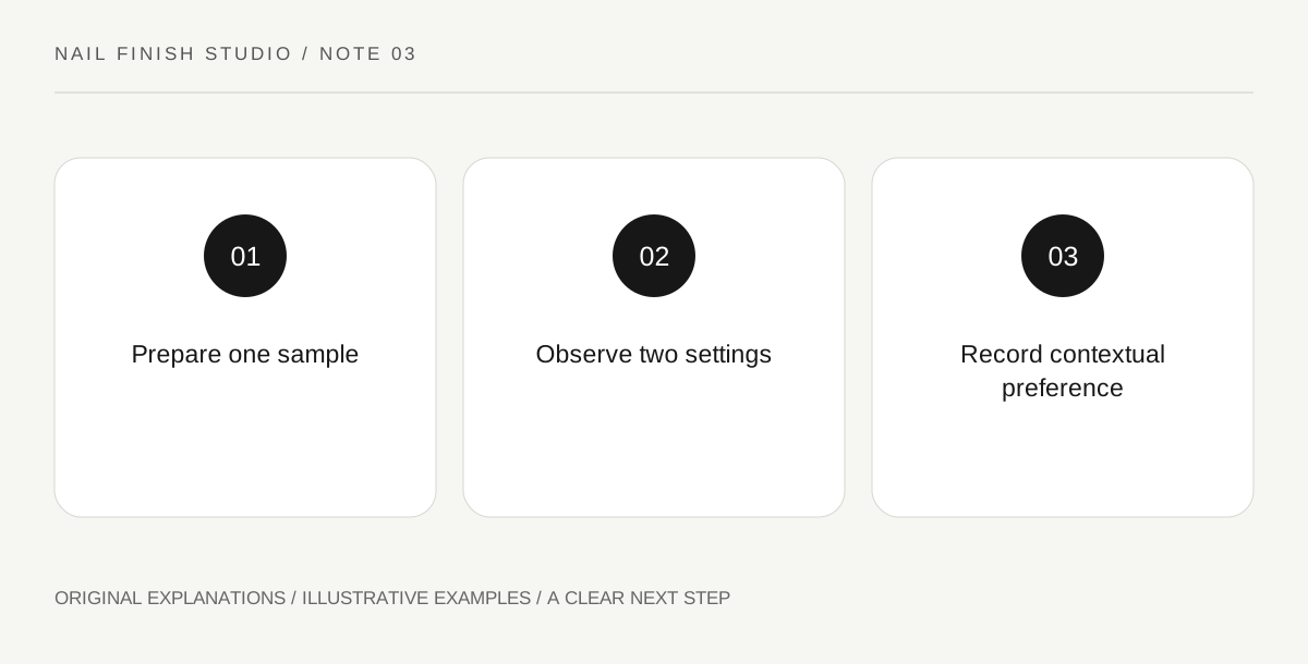
Original explanatory diagram. Read the full method and limitations below.
Keep the sample constant
Prepare one conventional-lacquer swatch using the supported application and allow it to reach the appropriate assessment stage. Label the product and sequence. Do not compare a fresh thin coat with a fully prepared multilayer sample and attribute every difference to lighting. The same physical swatch should move between the two environments. A simple controlled comparison gives a clearer answer than collecting unrelated photographs from different people and devices.
Observe the color without an outfit first
Look at the sample beside a neutral background in ordinary daylight, avoiding direct glare that obscures the surface. Describe what you see using plain terms: brighter, deeper, warmer-looking or more muted. Then view it under the room lighting relevant to your intended occasion. Let your eyes adjust to the setting. The useful result is a pair of observations, not a claim that one environment reveals the only true version of the color.
Add the clothing context
Place the sample near the fabric you expect to wear. A red that felt balanced alone can become a stronger accent beside a quiet outfit or seem less distinct beside another saturated color. Compare the actual fabric where possible. A small screen image of a jacket introduces another uncertainty. Decide whether the lacquer should echo a detail, provide contrast or simply remain a color you enjoy independent of the rest of the outfit.
Record a preference with its conditions
Write the lighting and surrounding material beside your decision. Prefer this with the charcoal sleeve in warm room light is more useful than perfect red. If the difference between the two settings bothers you, choose another swatch rather than adding filters to make the photographs agree. Keep the note modest: it records your visual judgment in the observed conditions and does not predict how the lacquer will appear on every wearer or camera.
Illustrative worked example
Illustrative scenario: a learner prepares one red swatch for an evening outfit. In daylight it looks brighter than expected; under the room's warm lighting it appears deeper beside the dark fabric. They prefer the evening relationship and save both observations. The bottle is not labeled deceptive, and the daylight photograph is not edited to mimic the evening view. The decision simply reflects where the manicure will be seen.
Questions that come up
Should I choose red by a warm-or-cool rule?
Such language can organize impressions, but personal preference and the actual context remain useful. A label cannot replace looking at the swatch beside the materials you wear.
Can I judge the color while it is still wet?
Follow the product process and assess a prepared swatch. Wet appearance and incomplete coverage can add variables that make the lighting comparison harder to interpret.
References and scope
These sources support the factual background. Examples and exercises are original illustrative teaching material. References do not imply endorsement.
- FDA: Nail Care Products — Follow labels and warnings, provide ventilation and handle potentially flammable nail products safely.