Find the hidden color in a gray lacquer by changing its neighbors
Gray lacquer can read blue, brown, greenish or nearly neutral depending on what surrounds it. Rather than debating the name on the bottle, compare the dried swatch beside a few controlled colors. This exercise turns an elusive undertone into a practical styling observation.
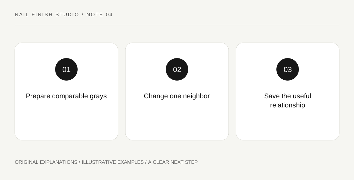
Original explanatory diagram. Read the full method and limitations below.
Begin with a small neutral group
Choose the gray lacquer and two nearby reference shades from products you already own if possible. Prepare comparable practice swatches according to each product's directions. Keep coverage differences visible in the notes. A translucent gray and an opaque taupe may behave differently because of the background, not only because of undertone. The group should be small enough that you can compare each relationship without creating a crowded color wheel.
Use one neighboring card at a time
Place a blue card beside the gray, then a warm brown card, then a plain pale background. Observe how the gray appears to shift even though the lacquer remains unchanged. Describe the relative effect: bluer beside brown, quieter beside navy, or slightly greenish near pink. These are useful observations rather than measurements of pigment composition. Do not claim to identify ingredients or a manufacturing formula from the way a color looks.
Connect the result to actual materials
Bring in a familiar coat sleeve, knit or bag. Surface texture can affect the overall impression as well as color. A soft gray knit and a glossy gray lacquer can form an intentional contrast without matching exactly. Decide whether you want the manicure to blend into the surrounding palette or remain visibly separate. This question is easier to answer than trying to prove the shade is an absolutely neutral gray.
Keep a relational swatch note
Label the sample with two short relationships and one context you prefer. For example, looks cool beside camel and calm beside charcoal. Avoid accumulating a long list of contradictory adjectives from unrelated lighting conditions. If you photograph the samples, retain a note of the physical materials and light. Return to the actual swatch for a purchase decision; digital images can obscure the subtle difference that made the exercise worthwhile.
Illustrative worked example
Illustrative scenario: a learner thinks a gray polish looks oddly blue beside a tan jacket. They place the same swatch beside navy and charcoal and find the blue impression much less prominent. They choose it for the charcoal outfit and keep another gray for tan. The conclusion concerns visual relationships. It does not classify the polish as incorrectly formulated or impose a color restriction on anyone else.
Questions that come up
Is there a perfectly neutral gray for every situation?
A shade can appear more or less neutral in a particular setting. Treat neutrality as a useful comparison goal, not a guarantee that surroundings will have no influence.
Should gray nails match metal jewelry?
They can coordinate without matching. Compare the whole effect and decide whether color similarity or a deliberate difference in shine and texture is more interesting to you.
References and scope
These sources support the factual background. Examples and exercises are original illustrative teaching material. References do not imply endorsement.
- FDA: Nail Care Products — Follow labels and warnings, provide ventilation and handle potentially flammable nail products safely.