Choose between a muted and a bright lacquer without changing the hue family
Two pinks can feel very different even when both belong to the same broad color family. Compare a brighter sample with a quieter one and ask how much visual emphasis you want. Keeping hue roughly similar helps reveal a preference that a long list of color names may obscure.
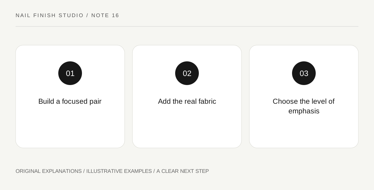
Original explanatory diagram. Read the full method and limitations below.
Build a focused pair
Select two conventional-lacquer swatches you already have, preferably with similar coverage and finish. One should feel more vivid and the other more subdued. They do not need to be scientifically matched; describe the differences that remain. Avoid comparing a sheer shimmer with an opaque cream and attributing the entire effect to brightness. A useful pair is close enough that you can explain why one attracts more attention in the intended context.
Observe them at ordinary hand distance
Place the samples side by side against a plain background and look from the distance at which you normally see your hands. Decide which sample catches your eye first and whether that is desirable. A vivid swatch is not automatically too much, and a muted one is not automatically more sophisticated. The observation concerns emphasis. Keep personal taste separate from unsupported rules about which colors a particular age, gender or skin tone may wear.
Add one familiar fabric
Place the same fabric beside both samples. A patterned or saturated garment may make a quiet lacquer feel restful; a simple dark outfit may leave room for a bright accent. These are options to assess, not compulsory combinations. Try the material you actually own rather than purchasing an outfit to justify a polish. If the surrounding fabric changes the preference, write that relationship down instead of deciding that the original comparison was wrong.
Define the desired role in one sentence
Finish with a concrete choice such as I want the manicure to be the strongest color detail or I want it to sit quietly with the patterned sleeve. Select the swatch that serves that role and keep the other as an alternative for a different intention. The exercise does not rank the two products. It clarifies how color intensity contributes to the complete appearance you are choosing on this occasion.
Illustrative worked example
Illustrative scenario: a learner compares a vivid berry and a dusty berry with similar opaque cream finishes. Beside a patterned blouse, they prefer the quieter sample; beside a plain charcoal top, the vivid one supplies the accent they want. They save both relationships. The decision becomes more specific than berry suits me, while leaving room for different preferences on another day.
Questions that come up
Is muted lacquer always more versatile?
Versatility depends on what you wear and enjoy. A bright favorite may work across many ordinary outfits if you like the consistent accent it provides.
Can I use a black-and-white photo to decide?
It can suggest differences in lightness, but it removes the color relationship being studied. Return to the physical samples before deciding between muted and vivid.
References and scope
These sources support the factual background. Examples and exercises are original illustrative teaching material. References do not imply endorsement.
- FDA: Nail Care Products — Follow labels and warnings, provide ventilation and handle potentially flammable nail products safely.